How to create a slick CSS animation from The Fall Guy
The Fall Guy (2024) is an action comedy movie about a down-and-out stuntman. The title sequence involves a simple animation of a man falling – a very literal depiction of the title! Let’s see how we can make it with CSS.
TLDR
You can see the brief title sequence in the official trailer (2m 41s timestamp) on YouTube.
Here is the finished animation.
About the title sequence
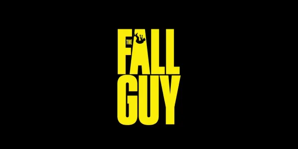
The title card has the name of the movie in large, tall yellow text with a black background. The first word – ‘THE’ – has a smaller font size than the other 2 words. It is tucked into the space between the arms of the letter ‘F’ of the second word.
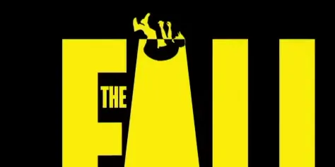
The animation involves a yellow silhouette of a man tumbling downwards through the letter A. As he passes into the letter, the fill colour changes progressively transitions from yellow to black as moves inside the letter.
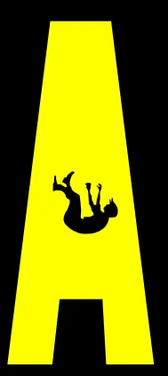
The letter A has the counter (enclosed area) filled in. The falling man stops close to the spot where the counter should be. This creates an interesting figure-ground impression.
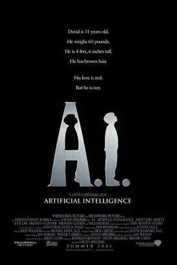
This is reminiscent of the poster for the movie A.I. Artificial Intelligence. Both use a silhouette of the main character to kind of knock out the letter A!
The typeface used in the title is a san serif font family. It is probably Solido Compressed Bold.
Implementation tidbits
To reference each of the words and the letter A of the second word, we need to use some inline elements.
<h1>
	<span class="word">The</span>
	<span class="word">F<i>a</i>ll</span>
	<span class="word">Guy</span>
	<img src="img/guy.svg" class="guy"
	 alt="silhouette of a falling man" />
</h1>
Since Solido Compressed Bold has a commercial license, I opted for a similar font family in Bebas Neue. Solido Compressed Bold has a bigger x-height than Bebas Nueue. In the implementation I compensated for this, I stretched the text through the scale CSS property.
.word {
  display: block;
  scale: 100% 130%;

  &:nth-of-type(3) {
    scale: 125% 130%;
    margin-inline-start: 10%;
  }
}
I fill in the counter (enclosed area) of the letter A by using a pseudo-element. The pseudo-element needs to be placed over the area. To prevent it overflowing the letter, it is cut down in size using the clip-path CSS property.
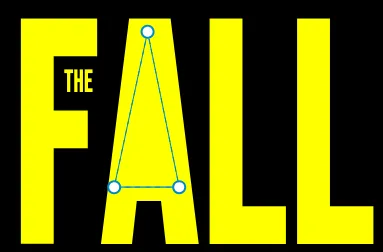
i::before {
  clip-path: polygon(48% 17%, 15% 100%, 79.25% 100%);
}
To create the fill colour transition of the guy, I use the mix-blend-mode CSS property.
.guy {
  mix-blend-mode: difference;
}
The animation
Ninety percent of the work is in the styling. The falling guy image is positioned above the letter A with the translate property with a negative number on the Y axis. The @keyframes animates the value of the property to zero to place the guy in his final resting position (don’t worry he survives 😉).
.guy {
  translate: 0 -500%;

  animation: fall 2s;
  animation-fill-mode: forwards;
  animation-timing-function: cubic-bezier(0.2, 0.5, 0.47, 1.06);

  /* other styles */
}

@keyframes fall {
  to {
    translate: 0;
  }
}
The easing of the animation (animation-timing-function) is in the ballpark of the ease-out keyword. I choose to use cubic-bezier() for more precise control.
Source code
You can check out all of the animations in this series in this demo collection.
Final thoughts
If you make strong choices with typography, a simple animation can shine. I quite like this one. It is not hard to pull off.