How to make a slick CSS animation from Arrested Development

Arrested Development is a satirical sitcom. The title sequence complements the kooky nature of the show well. Let’s see how we can recreate it in CSS.
TLDR
You can see the title sequence (15s timestamp) on YouTube. Here is the finished animation:
About the title sequence
The text of the title card is broken up over two lines. The first word has a reddish gradient and is in lower case. The second word is in black and is in uppercase, and it has a smaller font size than the first word.
The title uses a font that is blotchy. The font is probably FF Blur, which has a commercial license. I used a free font called Distro Bold instead.
The animation is slightly chaotic and kooky. The title zooms into focus from an offset position, it is circled roughly in red marker, and then glitches. I skipped the fade out part of the sequence.
Implementation tidbits
We always want each word of the title to be on separate lines. To do this we need to have each word as a separate element. Here is the outline of the HTML:
<h1>
<span class="word">arrested</span>
<span class="word">development</span>
</h1>
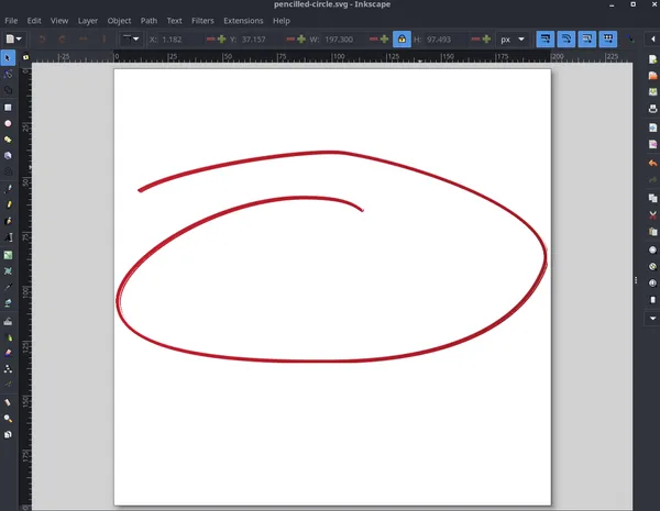
<svg id="circular-mark">...</svg>I created the red circular mark as a SVG. I drew the line in Inkscape illustrator. The line should be a single path element in the final SVG. I applied the “roughen” filter to the line to give it more of hand-drawn feel. You can find this filter in the main menu item Filters, and it is inside the Distorts category.
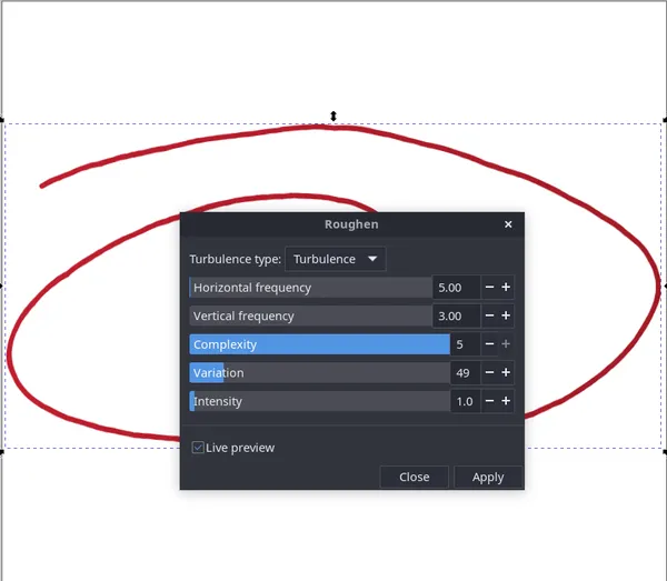
I played with the values in the filter dialog until I got the result I wanted. The line should vary in width and have a little bit of irregularity in the stroke. The outcome is a bit different that the original but I think that it captures the feeling.
The layout of the title requires it to be centered in the page, and have the circular mark on top of the h1. The easiest way to achieve this is to use CSS Grid to center all items on a page that covers the full screen. I place the h1 and svg in the same row and column.
/* body covers full screen and centers all items */
body {
  height: 100dvh;
  margin: 0;

  display: grid;
  place-items: center;

  overflow: hidden;
}

h1 {
  grid-row: 1;
  grid-column: 1;

  font-size: clamp(4rem, 1.6522rem + 10.4348vw, 10rem);
}

/* overlay svg on h1 */
svg {
  grid-row: 1;
  grid-column: 1;
}

/* ensures words on separate lines */
.word {
  display: block;
}
I set display:block on each word to ensure each word occupies its own line. I used clamp() to create a fluid font size to adjust to the screen width.
You can peruse the rest of the code at your own leisure.
The animation
Let’s look at each part of the animation. It can be seen as 3 discrete animations.
The entry animation
The entry animation has the title zoom in from a oblique, offset position and come into sharp focus.
Source Code
<h1>
  <span class="word">arrested</span>
  <span class="word">development</span>
</h1>
h1 {
grid-row: 1;
grid-column: 1;
font-size: clamp(4rem, 1.6522rem + 10.4348vw, 10rem);
margin: 0;
opacity: 0;
animation-name: entry;
animation-delay: 300ms;
animation-duration: 500ms;
animation-iteration-count: 1;
animation-fill-mode:forwards;
}
@keyframes entry {
0% {
opacity: 1;
translate: 100%;
scale: 4;
filter: blur(8px);
}
to {
opacity: 1;
translate: 0;
scale: 1;
filter: blur(0);
}
}
/* general */
body {
height: 100dvh;
margin: 0;
display: grid;
place-items: center;
overflow: hidden;
}Result
Therefore the initial state of the title is: positioned to the right of its final position, is closer to the viewer (bigger in scale), and is blurry. We can encapsulate this state as:
h1 {
  translate: 100%;
  scale: 4;

  filter: blur(8px);
}
I am using scale to kind of fake perspective here. Using a translation on the Z axis would be more accurate, however I find that it is easier to play with scale to get the desired result when animating.
The animation requires initially hiding the title by setting opacity: 0, and then returning the values of the aforementioned properties to their defaults. For example, we want the scale to be returned to 1. This is what the keyframes looks like:
@keyframes entry {
  0% {
    opacity: 1;

    translate: 100%;
    scale: 4;
    filter: blur(8px);
  }

  to {
    opacity: 1;

    translate: 0;
    scale: 1;
    filter: blur(0);
  }
}
The line drawing animation
<svg viewBox="0 0 200 200">
  <defs>
    <linearGradient id="a">
      <stop offset="0" stop-color="#c11d2e"></stop>
      <stop offset="1" stop-color="#a21a25"></stop>
    </linearGradient>
    <linearGradient id="b" x1="5.033" x2="202.633" y1="94.042" y2="94.042" xlink:href="#a" gradientUnits="userSpaceOnUse" gradientTransform="translate(-4 -8.138)"></linearGradient>
    <filter id="c" width="1.008" height="1.017" x="-.004" y="-.008" color-interpolation-filters="sRGB">
      <feDisplacementMap in="SourceGraphic" in2="turbulence" scale="1.03" yChannelSelector="G" xChannelSelector="R"></feDisplacementMap>
    </filter>
  </defs>
  <path fill="none" pathLength="1" stroke="url(#b)" stroke-width="1.611" d="M113.19 64.48c-5.924-4.83-15.165-5.534-24.343-5.743-39.77-.907-87.15 27.995-86.858 47.912.33 22.633 46.493 27.7 99.035 27.157 60.87-.627 88.115-21.994 95.875-43.258 8.5-23.29-53.938-46.112-90.84-52.155-15.104-2.474-75.355 6.15-94.086 17.236" stroke-linecap="round" paint-order="stroke fill markers" filter="url(#c)"></path>
</svg>
/* Use the same value as pathLength attribute. */
path {
--length: 1;
stroke-dasharray: var(--length);
stroke-dashoffset: var(--length);
animation: draw 2s;
animation-iteration-count:infinite;
}
@keyframes draw {
to {
stroke-dashoffset: 0;
}
}
svg {
width: 70%;
}
body {
height: 100dvh;
margin: 0;
display: grid;
place-items: center;
}Result
The trick is to set the stroke-dasharray and stroke-dashoffset to the same length of the path we want to draw. This leds to a blank space as there is a large gap between the stroke dashes. If we animate the stroke-dashoffset to a value of 0, the gap will shrink to draw the line.
The nice thing is that we dont have to measure the length of the path! We can set the pathLength attribute on the path to 1, and then use then use that value in our CSS! However in this case I found that a little bit of the line was exposed initially, so I used a slightly bigger value of 1.1 in the CSS. This may be due to the filter being used on the path.
The glitch animation
The glitch animation requires moving the text vertically very quickly. This can be done as translation on the Y axis, and adding a blur filter to the text. It is a matter of finding the right values for translate and filter: blur().
To simplify the animation, we can alternate the direction and repeat the animation multiple times in order for the text to go up and down. Here is a simplified version:
@keyframes glitch {
  to {
    filter: blur(8px);
    translate: 0 -30%;
  }
}

h1{
  animation-name: glitch;
  animation-duration: 200ms;
  animation-iteration-count: 3;
  animation-direction: alternate;
  animation-fill-mode: none;
}
Finally, we want to bring these 3 animations into sequence and coordinate their timing. You can check out the code to see explore more on that.
Final word
I was pleased that I could pull this animtion off in CSS. It is an intricate sequence. The CSS trick to animate drawing a line got me over the line!
Animating the blur() filter is an interesting effect that you don’t see often. I will add it to my arsenal. Although, it should be wielded carefully as animating filters is taxing for the browser.