How to create a slick CSS animation from Black Mirror
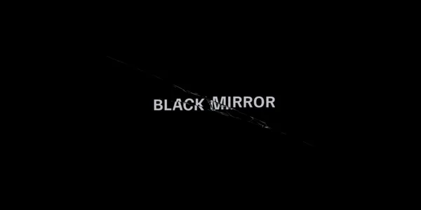
Black Mirror is a TV series featuring stand-alone dramas that explore near-future dystopias. The title sequence has a cool shattering effect. Let’s see how we can recreate it in CSS.
TLDR
You can watch the title sequence on YouTube if you are not familiar with it.
I focused on the final part of the animation where the title shakes and eventually shatters. Here is the finished animation.
About the title sequence
The title sequence is a mood-setter. It has an eerie feel to it. It features greyish text on a black background with slightly blurry characters. It is meant to be a mirror-y image.
It begins with a loading spinner. It sharply shifts to the formation of some text. It starts off as indecipherable characters, which are being quickly substituted with new characters, eventually it resolves to the title of “Black Mirror”.
Next, the title text starts to slowly vibrate and shake, it almost looks like a mirage. It increases in intensity until the title cracks and the background shatters into shards. The sound effects play a bit part in heightening the feeling of the title sequence.
The font used in the title is probably Proxima Nova Bold. I went for a free alternative called Familjen Grotesk.
Implementation
To create the cracked title, you need to duplicate the title 3 times. You can do this in CSS with psuedo-elements and use the clip-path CSS property to carve each one up into their final jagged form. To create the crack in the glass, it would be very involved in CSS, unnecessary hardship really. I opted to do in SVG instead to be able to draw the crack. The majority of the work is in preparing the SVG. The animation is mostly about small, quick movements.
Preparing the SVG
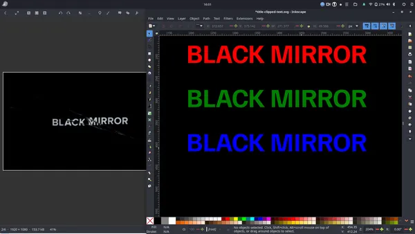
I opted to create the SVG with an equal width and height. To create 3 versions of the title text, we can define the title as a reusable element in the defs section and reuse it 3 times with use. This is easier to maintain, we only define the text content once.
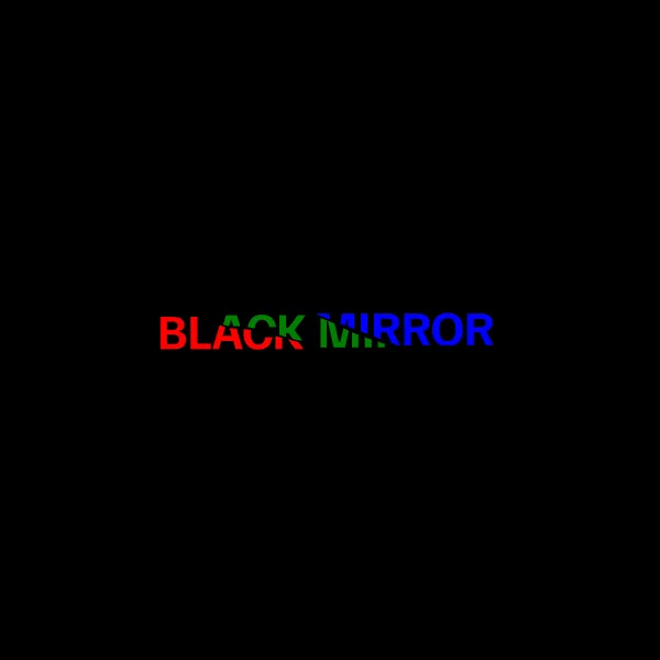
I like to create the basis of the initial image in Inkscape. I picked 800x800 for the dimensions - just enough space to work in. I created a text element for the title and set the correct font-family and choose a fitting font-size. Then, I prefer to jump out of Inkscape and edit the markdown in a text editor. I find clumsy to do some things in Inkscape. Below is a version that shows the 3 instances of the title in different colours to demonstrate how use works.
<svg viewBox="0 0 800 800" xmlns="http://www.w3.org/2000/svg"
  xmlns:xlink="http://www.w3.org/1999/xlink">
  <defs>
    <text id="title" font-size="60" font-weight="bold" font-family="Familjen Grotesk">BLACK MIRROR</text>
  </defs>
  <rect width="100%" height="100%" fill="black"/>
  <use x="194.3" y="219.5" xlink:href="#title" fill="red"/>
  <use x="194.3" y="319.5" xlink:href="#title" fill="green"/>
  <use x="194.3" y="419.5" xlink:href="#title" fill="blue"/>
</svg>
I like to take a screenshot of the final state of the title and have it open as reference beside what I am drawing.
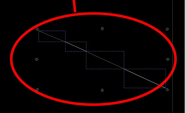
Next, I will clip the 3 instances to look like the final form of the cracked text. To clip an object in Inkscape, you use the Pen tool (press the letter B to select the tool) to draw a shape (path element) that encloses the part of the text you want to show. You want the shape to sit above the text. I selected a stroke of 1 and give it a color of white. You can see the result below.
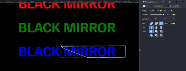
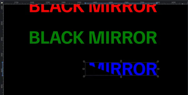
Now select the shape you’ve just drawn and the use instance representing the blue title. It can be found on the main menu under Object > Clip > Set Clip. You should see the text clipped as below:
If you want to undo the clip for further editing, you can go to main menu under Object > Clip > Release Clip, the same submenu as last time but different option.
We want to repeat this process for all 3 instances. We want to position them with a gap between them to appear in the final cracked state. See result below:
The markup looks like this:
<svg viewBox="0 0 800 800"
  xmlns="http://www.w3.org/2000/svg"
  xmlns:xlink="http://www.w3.org/1999/xlink">
  <defs>
    <text id="title" font-size="60" font-weight="bold" font-family="Familjen Grotesk">BLACK MIRROR</text>
    <clipPath id="right">
      <path fill="none" stroke="#ffffff" d="m 377.47157,374.86777 12.08429,8.80981 31.35505,12.1044 65.65686,25.02513 160.46625,-0.56066 v -48 z"/>
    </clipPath>
    <clipPath id="middle">
      <path fill="none" stroke="#ffffff" d="m 249,379 c 4.59149,3.84963 8.93873,8.11824 13.6799,11.71111 5.90255,1.7087 11.48568,5.16437 17.81051,4.56342 10.40731,0.13375 20.9216,0.57695 30.93385,3.65899 16.57322,3.74967 32.81225,8.73536 49.09969,13.54197 6.96156,0.25421 13.92313,0.50842 20.88469,0.76263 -0.8333,4.69554 -1.66661,9.39107 -2.49991,14.08661 31.44072,-0.15952 62.88145,-0.31903 94.32217,-0.47855 0.486,-2.13752 4.52764,-5.68442 2.76235,-6.92957 -20.84288,-7.04231 -42.47629,-12.36247 -61.72017,-23.3628 -12.49246,-6.91604 -26.25356,-11.00403 -39.41777,-16.42193 -33.45947,-0.84004 -66.93767,-0.58664 -100.40512,-0.96145 C 265.9668,379.11362 257.4834,379.05681 249,379 Z"/>
    </clipPath>
    <clipPath id="left">
      <path fill="none" stroke="#ffffff" d="m 180.99957,373 c -2.5,54 -1.5,53.5 -1.5,53.5 l 201.5,-1 -5,-10.5 -68.5,-17.5 -28,-2 -56.5,-24 z"/>
    </clipPath>
  </defs>
  <rect width="100%" height="100%" fill="black"/>
  <use id="use1" x="195.3" y="421.1" fill="red" xlink:href="#title" transform="translate(-4.7000031,1.9999939)" clip-path="url(#left)"/>
  <use id="use2" x="195.3" y="421.1" fill="green" xlink:href="#title" clip-path="url(#middle)"/>
  <use id="use3" x="195.3" y="421.1" fill="blue" xlink:href="#title" transform="translate(-4.79957,-2.1000061)" clip-path="url(#right)"/>
</svg>
If you open this SVG in a browser, you will not see the text! For some reason, browsers do not like the markup that Inkscape has produced here.
We will give the 3 instances the same fill, and tweak the clip paths later to look exactly as we want it to.
Let’s move onto the drawing the crack. There is no secret sauce here. It is really just a case of patiently drawing the distinct fragments of the cracks.

My process to draw the hairline cracks is to draw a series of line segments using the Pen tool. I only use the stroke-width and stroke properties to define the width and colour. Wherever the width varies, I draw a separate line. These fainter stress fractures tend to have a color closer to black. Wherever the strain is more pronouced they are lighter in colour.
For the shattered sections, I draw enclosed shapes with the Pen tool, and use a single fill colour. Creating more elaborate shapes and using a gradient as the fill is too finicky. Any place the colour varies, I create a new shape. You don’t need to be that precise. The colouring tends to be closer to white.
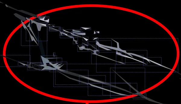
When you are zoomed in very close like this, it is hard to believe that it will look believable. However at the normal viewing level it looks legit! Below is the final result…
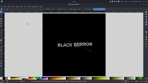
The final part of the preparation is some minor tweaks and optimizing for use in CSS. I organized the elements into groups to make them easily referencible - a group for the text instances with an id of “title”, and a group for all of the elements that make up the large crack with an id of crack. I added a bit of blur to the title using a gaussian blur filter, it can be found on the main menu under Filters > Blurs > Blur.
I needed to see if I could figure out how to get the SVG title to show in the browser. I played around with some variations on the clipPath elements and had no joy. In the end, I found it easiest to remove the clip paths from the SVG and declare them in CSS instead.
The animation
The animation can be broken into 2 distinct parts:
- The title is slowly moving towards the viewer (zoom in), and it begins to vibrate and shake with increasing intensity.
- The title splits apart and the background cracks.
Part 1 - Zoom and shake animation
To zoom in on the title, you can either use scale or use translate on the Z axis. It is a bit easier to use scale because you do not have add perspective to the parent element which can have more of impact on other animations. The following will give us a slow, smooth zooming out effect, its in a loop to demonstrate:
The hardest thing to figure out was how to create the vibrations that appear almost like a mirage with the text appearing to quiver. I thought that maybe I would need to use a more complex SVG filter, but after some experimentation I found that alternating blur back and forth using animation-direction: alternate-reverse, and moving the title up and down a small amount quickly gives the desired effect. These animations need to be done concurrently.
The final action in this sequence is to move the title up and down with greater movement and intensity. The shake keyframes is below.
@keyframes shake {
  to {
    translate: 0 -5px;
  }
}
We need to sequence these actions correctly into a “timeline” for our title text element. The sequence is:
scaleruns from the start of animation for 3 seconds. All other actions are concurrent with it.blurruns 1 second into the animation. It last 1988ms, nearly 2 seconds. It runs 14 times in 142ms increments, alternating in direction forward and backwards.quiveris concurrent withblur. It begins one second into the animation and finishes one second later. It runs 10 times at 100ms increments.shakestarts 2 seconds into the animtion. It takes over fromquiverto control the vertical movement of the title and overlaps withblur. It lasts one second - runing 20 times at 50ms increments.
These series of actions last 3 seconds in total. Below is what the CSS looks like, not easiest to come to the same interpetation!
#title-text {
  animation-name: scale, blur, quiver, shake;
  animation-duration: 3s, 142ms, 100ms, 50ms;
  animation-iteration-count: 1, 14, 10, 20;
  animation-delay: 0s, 1s, 1s, 2s;
  animation-direction: normal, alternate-reverse, alternate-reverse,
    alternate-reverse;
  animation-timing-function: linear, linear, ease-in, ease-in;
  animation-fill-mode: forwards, none, forwards, forwards;

  transform-origin: center;
}
Part 2 - The crack animation
The default state of the use instances that make up the 3 versions of our title is that they all stacked on top of each, and have no clip-path applied. The crack is hidden.
To animate the cracking of the text, we are applying the clip-path to each instance, and we are moving the outer instances away by a small distance from the middle instance. When this is done very quickly, one hunderd milliseconds looks to me, it looks realistic.
For example, for the right instance, we move it in north-east direction and apply its clip path:
:root {
  --crack-delay: 3s;
  --crack-duration: 100ms;
}

#title-right {
  --crack-clip: polygon(
    70% 24.4%,
    100.52% 23.9%,
    100.52% 88.3%,
    64.31% 87.8%,
    43.96% 42.04%,
    40.33% 27.3%
  );

  animation-name: crack-right;
  animation-delay: var(--crack-delay);
  animation-duration: var(--crack-duration);
  animation-fill-mode: forwards;
}

@keyframes crack-right {
  to {
    clip-path: var(--crack-clip);
    translate: 1% -1%;
  }
}
To illustrate the interplay of the elements visually, let’s add back our unique colours for each use instance (red, green, and blue), and slow the animation down to three seconds.
To crack the glass background, we are animating its opacity from zero to one in sync with the cracking the text.
Title sequence demo collection
You can check out all of the animations in this series in this demo collection.
Final thoughts
This is a potent animation when it is accompanied by sound effects. It probably feels a bit underwhelming without sound effects!
To recreate the animation, the hard graft was in the creation of the SVG, drawing the crack in the glass. When you break the animation down into discrete steps, you will find the animation a lot easier to reason about. The effort is in sequencing the actions. Creating a timeline in CSS is a bit cumbersome, if you practice with trying to make 2 animations overlap and run back-to-back, you will get the hang of it.
An interesting find for me was creating a mirage-like effect by animating filter: blur() and translate concurrently.