roboleary.net - new design and refactor
I did a quiet launch of a new design of my website recently. The big ticket items have been done for a while now. I wanted to observe the real-world performance and tweak things before drawing attention to it. What do you think?
I will include some screenshots here to record the general look and feel. I will discuss the stack and performance briefly. I will keep it light, I don’t want to be a blow-hard!
I still consider this a work-in-progress. There is more to come!
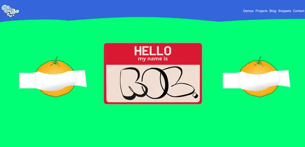
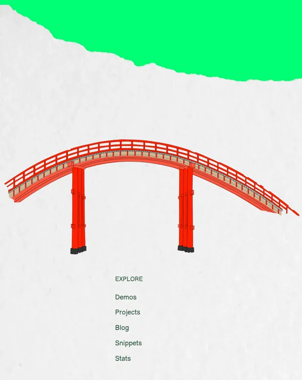
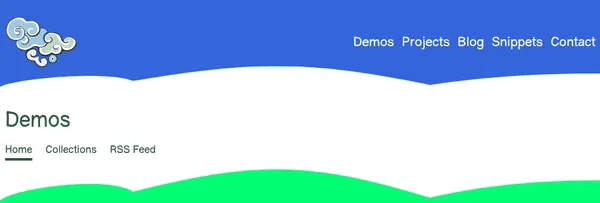
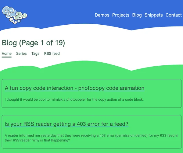
Screenshots

Why am I making this website?
It is a good idea to ask yourself why you are doing something before you do it! Especially if you are hurling yourself headlong into a big redesign or a new tech stack. The time it takes is often underestimated.
In the past, my website did not have a design or a clear raison d’être! I made my own website because I like to make things. I wanted to develop more front-end skills and I thought that having some evidence of that competence may be benefical to my career some time!
This website became a playground for me to experiment with web features and frameworks. It became a first cousin of frankenstein’s monster in a hiccup. I learned a lot more about front-end along the way but it wasn’t much of a website. I wanted to make it more of a website.
Now, I see the purpose of this website as a notebook to record and share things that I learn, make, and that shape me. I share in the hope that something will be helpful to someone some time.
It is important to me to be able to publish things without the influence of corporate interests. To make things that matter to me, to make things that are not designed for appeasing an algorithm, or finding an audience. To have a digital (mental) space free of those concerns.
Websites in the AI age – I am trying to make sense of that.
The design ethos
I wanted to make something joyful. Something that feels fresh and fun. I want this website to be a home to things that are interesting and inspiring. I want it to feel hand-made.
Generally, I like a minimalist aesthetic. I favour simplicity. Imperfections are welcome.
I’m not a designer, the design is based more on intuition than design principles. I picked some real world things that possess the qualities I like, and I tried to extrapolate from them to produce my own thing.
The tech stack
I stuck with Eleventy. The simpler static site generator!
I upgraded from version 2.x to version 3. The dev mode performance is better. I was able to make changes that lean into the Eleventy’s new capabilities to do less work.
I stuck with Nunjucks as the template engine. I found that with the improvement of plugins such as bundle and render, I could simplify my approach to templates and styles. I am using vanilla CSS and merging files with the bundle plugin when necessary.
I did a major refactor. I moved from Common JS to ESM. This takes time when you have a large configuration set like I do! I refactored my configuration into local plugins. I came up with a different scheme for my files, mostly everything that is related to a page is co-located now. This makes life a lot easier.
Perhaps, I will discuss this further on another occasion.
Performance
I was able to improve the performance of the website considerably.
Based on Cloudflare’s analytics of my website for the last 30 days (ending 11/11/25), the core web vitals:
- 88% of visitors experience quick rendering - “good” Largest Contentful Paint (LCP)
- 95% of visitors experience good responsiveness - “good” Interaction to Next Paint (INP)
- 97% of visitors experience good visual stability - “good” Cumulative Layout Shift (CLS)
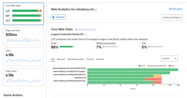
Overall, the performance is at a very high level. I can switch off analytics now to give perf a further nudge!
If you have any feedback, I would be happy to hear from you!