Sumptuous stroked text in CSS

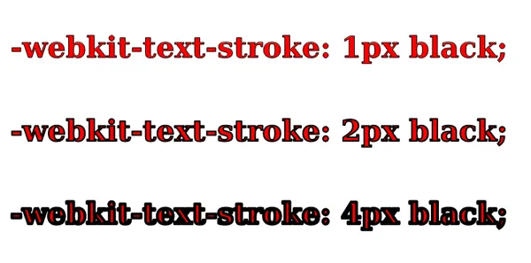
You can create stroked text in CSS, but unfortunately, it is unwieldy. The existing “nonstandard” properties (-webkit-text-stroke and friends) have a very basic specification and implementations are inconsistent across browsers.
I submitted a proposal to Interop 2025 to improve this feature. Give it a vote! 👍
What are the specific problems?
Depending on the font and property combinations used, the stroke can be drawn with mistakes. Cursive fonts are particularly problematic.
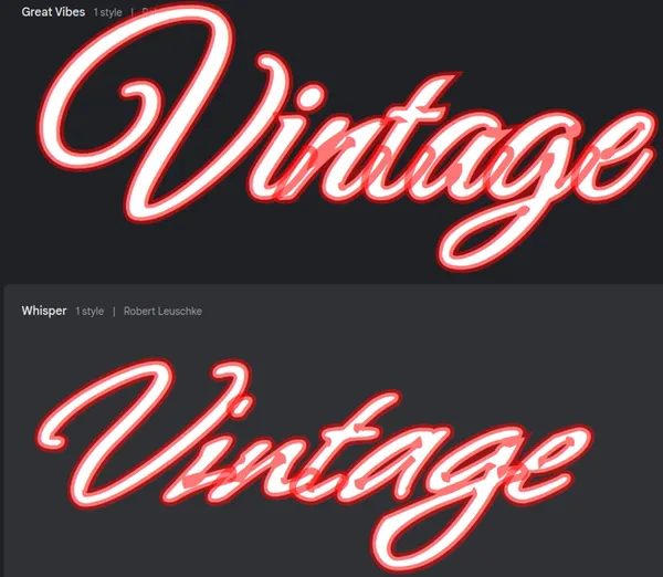
Stroke corners don’t look the same in all browsers for some fonts.

The paint-order property, which controls if the stroke or the fill is on top, is buggy but has gotten better.
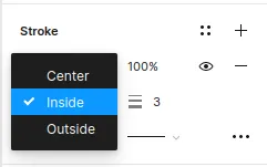
paint-order to be consistent to avoid this mess. Ideally, you want to control the alignment of the stroke to decide how the stroke and fill co-mingle.And stroke alignment is not a thing in CSS. Since stroke alignment is a thing in design tools like Figma, some designs cannot be done in CSS! This is the perfect recipe for snarky behaviour between designers and devs! 😅
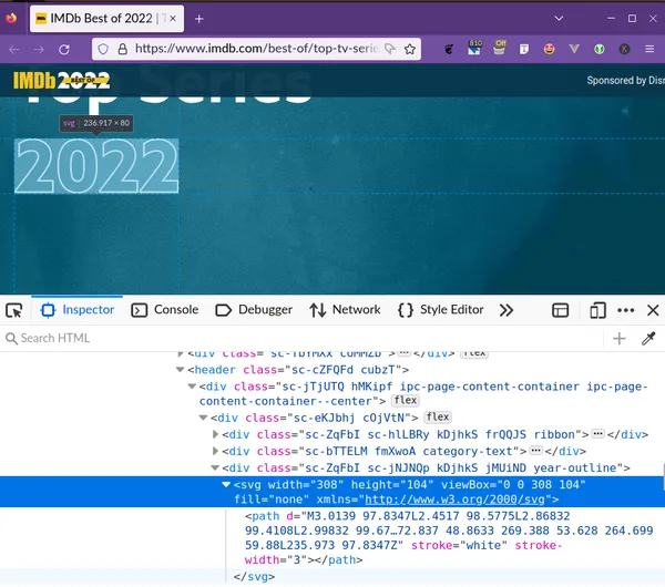
You are more likely to use a SVG for stroked text because you have consistency and more control. You don’t want an image in lieu of text for many reasons!
What should be done?
Alas, there is the CSS Fill and Stroke Module Level 3 Specification from the W3C that covers the same “nonstandard” properties. Sounds like a perfect thing for the Interop initiative to work on, right?
Give my proposal a read to learn more. And give it a 👍 if you’d like to see it done!
Thanks for reading.