Elevate hover/focus effects with transitions across multiple elements
You can elevate hover and focus effects by triggering transitions on more than one element. With the right orchestration of transitions, you can create more nuanced and beautiful effects.
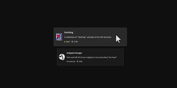
In this example, we have a collection of cards outlining Git repositories. The hover effect involves 4 transitions on 3 different elements. On hover, the card is scaled up and its background color changes to a lighter colour, and both the image and the circle marker for the language transition from fully destaturated to fully saturated. You can try the effect below!
The code breakdown
Let’s break down the code by exploring a simplified version. In this version, when you hover over the card, the background color of the card changes to a lighter colour, and the saturation of the image changes from fully destaturated to fully saturated.
Here is an outline of the HTML for a card:
<li class="card">
    <h3><a href="..">Fetching</a></h3>
    <img class="logo" src="img/fetching.webp" alt="Fetching logo">
    <p>A collection of *fetching* unicode art for the terminal.</p>
</li>
To pull off this effect, we use the :hover pseudo-class to trigger the transitions. We target the individual elements by including the card class with the hover state at the beginning of each CSS declaration to effect the transitions, and follow it with a selector to target a child element.
/* initial styles */

.card {
  background-color: hsl(0, 0%, 10%);
  transition: background-color 300ms ease-in;
}

.card .logo {
   filter: saturate(0);
   transition: filter 300ms ease-in-out;
}

/* hover styles */

.card:hover {
  background-color: hsl(0, 0%, 16%);
}

.card:hover .logo{
   filter: saturate(1);
}
You can adjust the easing and duration of the transitions to find more pleasing results.
Create a focus effect with transitions across multiple elements
We can invite keyboard users to the party by using a focus effect. We want the transitions to be triggered whenever a user tabs onto or into the card.
You can use the focus-visible or focus-within pseudo-classes to trigger the transitions depending on your card layout. Nowadays, you can largely skip using the :focus pseudo-class, it puts a focus ring around elements more often than desired.
For this to work, the card or one of its descendants must be a focusable element i.e. be a tab stop. Usually, the card will have a link (an a element),which is a focusable element by default. The 2 broad use cases are:
- The card or its entire contents are contained within a link. You can use
:focus-visiblehere, although:focus-withinwill do the same job. - The card has children that are links. You will need to use
:focus-withinin this case.
Below is the second use case in action, the title of the card is a link.
I use :where() to make the declaration more readbale including both the hover and focus states.
/* hover and focus styles */

.card:where(:hover, :focus-within) {
  background-color: hsl(0, 0%, 16%);
}

.card:where(:hover, :focus-within) .logo{
   filter: saturate(1);
}
Keep in mind that :where() keeps the specificity low. The specificity of .card and .card:where(:hover, :focus-within) are actually the same, so make sure the hover/focus styles come after the initial styles of your card in your stylesheet.