A glorious demo gallery
I added a demo gallery to my website. A place to showcase some of my frontend adventures. I also added a dedicated RSS feed at https://www.roboleary.net/demos/feed.xml. 🤗
Why did you do this?
The primary motivation was to create a beautiful showcase for my demos. Hosting demos in other places comes with compromises. Below are the specific motivations.
Accesible to everyone
I wanted to make accessibility a priority. I noticed that the previews in the most demo galleries are not descriptive. It is either an image that that has nondescript alt text; or it is an iframe with a nondescript title. Putting demos on my own website creates the opportunity to be more inclusive, and to provide a better browsing experience for more people.
Create a wonderful browsing experience
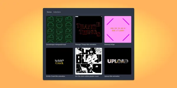
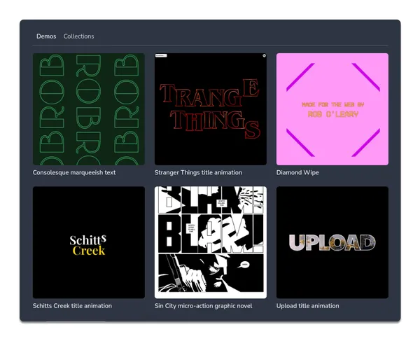
I would like to be able to see a beautiful preview card for each demo and be able to browse demos quickly. Larger images with a 1:1 aspect ratio strike the right chord for me.
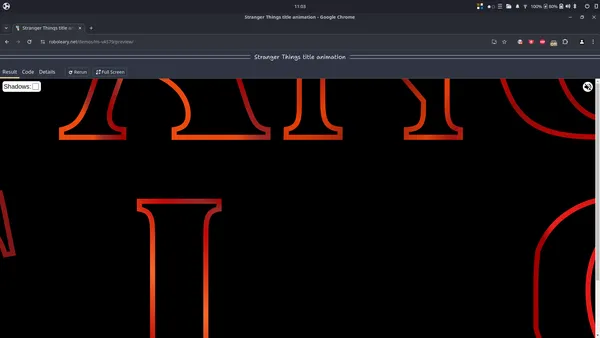
Also, I want the default view of my demos to show the result prominently. The result pane of my demos are given approxmiately 90% of the viewport and are close to the aspect ratio of the device. You can switch to another tabbed pane to view the code and read information about the demo.
I would like performance to be excellent in order to be able browse through demos efficiently. To constrast the performance of my gallery with demo platforms such as JSFiddle and Codepen:
- Each page of my gallery is going to load in approxmiately two seconds on a slow 4G connection on a mobile device. This is at least 3 times faster than the typical demo platform. Some demo platforms use an
iframein the preview cards. I stick with optimized images. - The difference in performance for a demo page is starker. The same demo is going to load at least 6 times faster on my website. The demo platforms permit editing while I do not.
The point of this short comparison is not to dunk on demo platforms. I just want to highlight how different approaches led to different outcomes. My starting point is that I typically just view the demos that I browse. That’s why I chose to make the demos in my gallery read-only for now. Editing powers come at a significant price.
Have content under my own roof
I want to put more content under my own roof. I want the things I put out in the world to be aligned with my values. Generally, this is not possible with platforms. User experience tends to deteriorate over time to meet financial goals.
Create a workflow for builing and publishing
I wanted to create a workflow for building and publishing demos. I want to minimise the effort in organising and publishing my content. There are a few things that make it easier for me to do this:
- A demo is a simple to make. It is the same as adding another webpage on my website. The build takes care of the details.
- I can organise demos whatever way I want within my designated
demosfolder. I can group demos together as collections by putting them in a subfolder and including some folder-level metadata (directory data files in eleventy), or by adding some front matter fields in the demo template. - I can control the production of preview images. For animated demos, I can take a delayed screenshot to capture a particular moment. It is a semi-automated process at the moment. I can make it into a scheduled batch job later.
Subscribe to the RSS feed
You can subscribe to the demos feed at https://www.roboleary.net/demos/feed.xml. This is what you will see in a RSS reader:
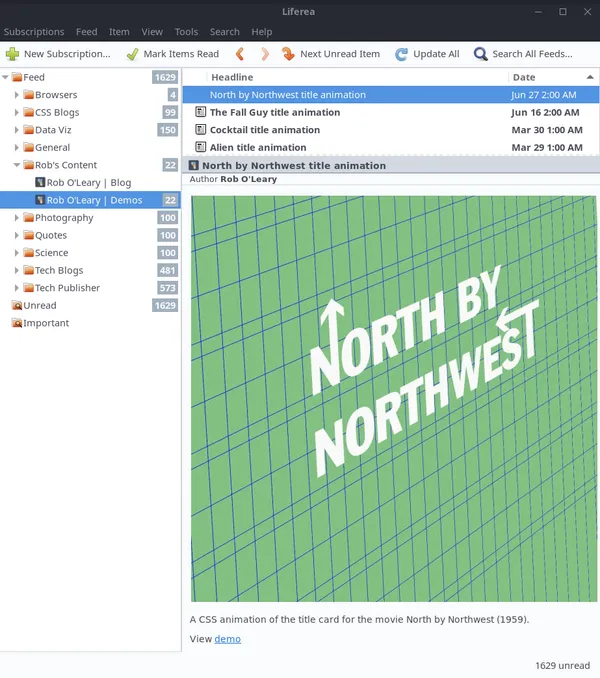
Each entry in the feed shows a preview image, a link to the demo, and a description.
Final thoughts
I’m happy to have a new home for my demos. I think that the user experience is great – the accessibility and the performance is at a high level. It looks decent. I hope to iterate on the appearance soon when I give my website a refresh. It opens up more possibilities going forward. If you any thoughts or feedback of a constructive nature, let me know!
Thanks for reading! 🙏