Truncate text after multiple lines with fadeout
Sometimes you want a layout to be predictably consistent. To achieve this, you may need to restrict the length of text content by truncating it (cutting it off at a certain point). The most commmon instance is where you want card components to have an uniform size.
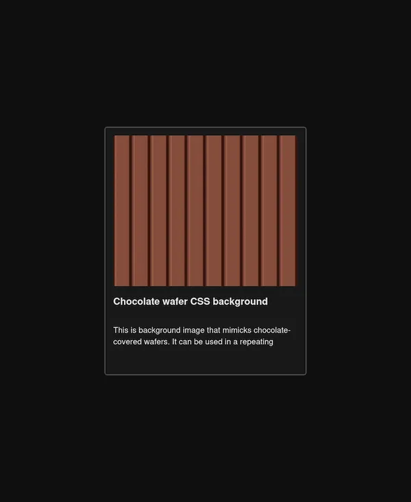
To provide a hint to the user that the text is truncated, the text can be faded out gradually towards the end of the block. It is a more elegant approach than using ellipsis in my opinion.
.truncate-lines-fadeout {
  --num-of-lines: 3;

  overflow: hidden;
  max-height: calc(var(--num-of-lines) * 1lh);

  /* fade out */
  --fadeout-height: 1lh;
  --fadeout-width: 50%;

  mask-image: linear-gradient(black, black),
    linear-gradient(
      to right,
      hsl(0, 0%, 0%) 0 calc(100% - var(--fadeout-width)),
      hsla(0, 0%, 0%, 0)
    );
  mask-size: 100% calc(100% - var(--fadeout-height)), 100% var(--fadeout-height);
  mask-position: top, bottom;
  mask-repeat: no-repeat;
}
This snippet should be usable in the vast majority of cases. It is responsive to variance in font-size and line-height as it uses the lh unit. The fade out effect is independent of the background colours as it uses the mask property.
I prefer this technique to the alternatives techniques generally. A disclosure widget may be more appropriate for some scenarios.
Demo
Explanation
Truncating the text after a number of lines (line clamping)
Let’s start by discussing the restriction of the height of the text block. We are rolling our own line clamp really! We do this by setting a max-height using the lh unit. The lh unit is equal to the computed value of line-height. This makes it adjust to changes in font styles.
.truncate-lines {
  --num-of-lines: 3;

  max-height: calc(var(--num-of-lines) * 1lh);
  overflow: hidden;
}
We truncate the text through overflow: hidden.
Fading out of last line
The fade out effect is more complex! The objective is to gradually change the text of the last line from opaque to semi-transparent to transparent. We can use a left-to-right linear gradient in a mask to do this.
Unfortunately, there is a gotcha that complicates matters. The gotcha is a mask applies to the whole element. If we apply a mask with a left-to-right gradient on the whole element, it will fade out all lines. If we position a mask to only cover the last line, the other lines of the text block are hidden! One mask is not going to cut it.
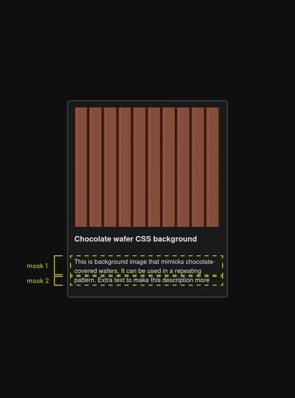
The solution is to use 2 masks:
- Mask 1 will cover the initial lines to reveal them.
- Mask 2 will cover the last line and will fade it out gradually.
Let’s cover the size of the masks first. Again, we can base this on the lh unit to size them according to line height. The first mask must have a mask-size that covers the initial lines, that is the height of the element (100%) minus the height of one line (1lh). The second mask covers our final line, which is a height of 1lh. I use a CSS variable for clarity.
.fadeout {
  --fadeout-height: 1lh;

  mask-size: 100% calc(100% - var(--fadeout-height)), 100% var(--fadeout-height);
  mask-repeat: no-repeat;
  mask-position: top, bottom;

  /* more to follow */
}
By default, masks are repeated to fill an element similar to the background property. To ensure we only have one version of each mask, we set mask-repeat: no-repeat.
By default, the masks overlap as they are both positioned in the top right corner. We need to use mask-position to position the second mask underneath the first mask. We can do this by using the top value for the first mask, and bottom value for the second mask.
Finally, we want to apply the gradients for the masks through mask-image.
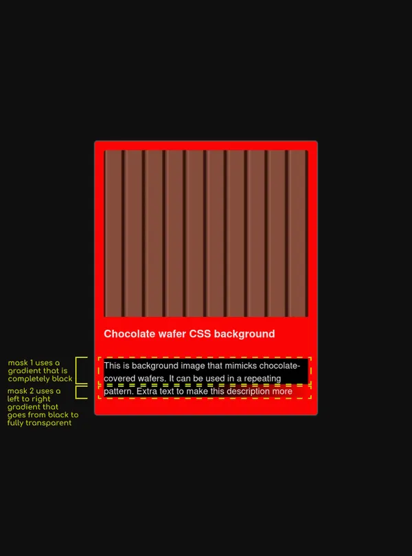
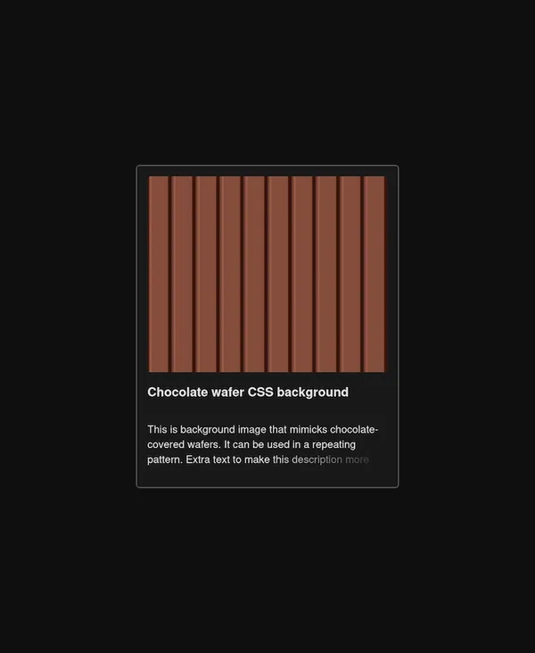
mask-image with the gradients projected onto the description paragraph. The background of the card is changed to red to show the gradients clearly.For the first mask, we want it to be completely black. This is because anything that is masked in black is visible. To have a linear gradient with a single colour, you can provide the same colour twice – linear-gradient(black, black). This makes only the first 2 lines visible.
.fadeout {
  /* previous styles */

  mask-image: linear-gradient(black, black);
}
For the second mask, we apply a left-to-right gradient that uses transparency to fade out the latter part of the line. The first stop is black, and the second stop is black with 100% transparency. I use a variable to specify the portion of the line that is faded. I found that beginning the fade at the halfway point looks good. You can tweak/rework this to your taste.
.fadeout {
  /* previous styles */

  --fadeout-width: 50%;

  mask-image: linear-gradient(black, black),
    linear-gradient(
      to right,
      hsl(0, 0%, 0%) 0 calc(100% - var(--fadeout-width)),
      hsla(0, 0%, 0%, 0)
    );
}
And we’re done!
Alternative methods
Truncate after multiple lines with line-clamp and append ellipsis with text-overflow: ellipsis
This method requires using the line-clamp. This property has limited browser support. It must be used with a deprecated property. It’s best not to use this!

See truncate text after multiple lines with an ellipsis snippet for more info.
Truncate after multiple lines with max-height and add an ellipsis manually with a pseudo-element
As I have shown in this snippet, you can use max-height to restrict the height of a block on line height.
To manually add an ellipsis to the end of the truncated text, you can use a pseudo-element. The difficulty is that you only want to do this if the text exceeds the maximum number of lines permitted. You can place a second pseudo-element over the first pseudo-element to obscure the ellipsis when the block does not overflow. The downside is that the second pseudo-element needs to have the same background color as the containing element. You must keep these in sync!
Another downside of this approach is that visually it can look off sometimes. It is not possible to have the ellipsis aligned exactly with the end of the truncated text because the line length can vary. Sometimes there is a considerable gap between the truncated text and the ellipsis.
You would need to reach for JavaScript to eradicate this gap consistently.