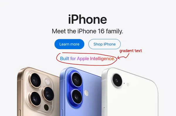
Gradient text
CSS gradients allow a progressive transition between two or more colors. We can use a gradient to colour text to create an eye-catching aesthetic. This has become a popular choice on websites showcasing tech products.
.gradient-text {
  color: transparent;
  background-image: linear-gradient(90deg, #ef476f, #ffd166);
  background-clip: text;

  /* Not necessary, but increases support slightly with older browsers. */
  -webkit-background-clip: text;
}
Demo
Explanation
The effect is created by making the text transparent and showing the background through the text content.
We use color: transparent to make the text transparent. You may see -webkit-text-fill-color: transparent or text-fill-color: transparent used in other solutions, do not use this property. This is a non-standard property. Only the prefixed version is supported, text-fill-color: transparent does not work!
We use background-image to add a gradient, whatever type you wish using one of the gradient functions such as radial-gradient() and linear-gradient().
If we just use the color and background-image properties together, all we can see is a rectangle with a gradient. No text!
What is happening is the opaque background is filling the entire element. We need to use background-clip: text to clip the background to the text content. Previously, it was necessary to use a prefixed version of this property -webkit-background-clip:text, but the unprefixed version is widely supported in browsers now.
Accessibility
We should always strive to ensure that the contrast ratio of text is high enough that people with weaker vision will be able to read the content of the page. Web Content Accessibility Guidelines 2.1 has minimum conditions on contrast ratio for text that states text should have a contrast ratio of at least 4.5:1 against its background, while larger text (18pt or 14pt bold) should have a minimum ratio of 3:1.
This is more challenging to get right when we use a gradient with multiple colours. Accessibility tools such as Deque’s Axe do not report on text elements that use background-image to provide color for text. Therefore, an accessibility issue is likely to be missed by dev tools.